Performance Optimisation of JavaScript Applications & Charts
I started programming a long while ago, in 1987 I wrote my first lines of code in Basic on a […]
Trading, investing is a little bit of a passion of mine. In my career, I’ve worked in Tier-1 Investment banks, trading firms and been involved in one way or another with financial markets for over 10 years. My company, SciChart, has to balance and hedge incomes in Euros and Dollars. I post over on my Twitter about trading, as well as SciChart and business & entrepeneur tips I’ve learned over the years.
Also, I’m a software engineer and big proponent of High Performance WPF Charts as you know! So, I thought to myself ‘what if I combine these two skills in a project’? Enter: Algorithmic Trading with SciChart.
The cryptocurrency market (Bitcoin, Ethereum etc…) is extremely volatile. It’s notoriously difficult to trade. We’re talking about a market where an asset increased 20x in a single year (January 2016 – December 2017) and then decreased by 70% in the following year. How is such a market tradeable?
It turns out, it is.
With simple rules, signal processing and statistical analysis, I created a trading algorithm which yielded 200% returns year-on-year, or 600% in a specific two-year period.
Divulging exact specifics of my trading algorithm would be giving away valuable information, but I can tell you that it used a combination of the following.
In other words, there’s no crazy magic behind this algorithm, it doesn’t use AI (artificial intelligence) or Machine learning. It doesn’t divulge sentiment from twitter posts or anything like that. Just good old-fashioned trading techniques automated into a bot which isn’t subject to human emotion or hesitency.
So how well does this trading algorithm perform? In simulated backtests, it averages 200% year on year with historical data on the BTC/USD pair on Binance, or up to 600% for a two-year period. Pretty incredible!
You can watch a webinar below talking about the trading algorithm and implementation with SciChart, or read on to find more details below.
We haven’t released the source-code for this project (as you can imagine, it’s potentially quite valuable) and I don’t want to give away too much about how we built this or what the trading algorithm does.
What I do want to do, is highlight the capabilities of SciChart in financial, algotrading and quantitative-trading applications, and show you a little bit about how you can build (the architecture of) an application like this.
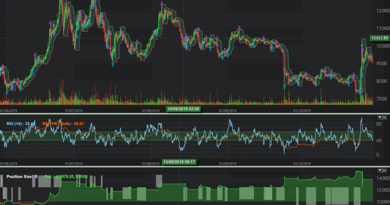
SciChart has the abillity to display multiple series on a chart pane. For example, in our own backtester and trading algorithm we use multiple timeframe analysis. What if we could display multiple timeframes on the same chart? Turns out we can, the below screenshot shows Daily candlesticks overlaid over 2-hour candlesticks. It gives an extra dimension to the data to be able to view what the price is doing both intraday, and daily.
SciChart can display multiple charts, and link them together. Using this feature we’re able to create a multi-pane stock chart control which looks and acts like a stock trading platform. This feature allows us to create complex dashboards, and visualisations but is especially useful in trading apps.
In the image above we actually have four SciChartSurfaces or ‘chart panes’ linked together. These are showing:
Note: We’ve used WPF (Windows) for this application but all these SciChart features are available cross-platform: on native iOS/Android (mobile), MacOS as well as JavaScript.
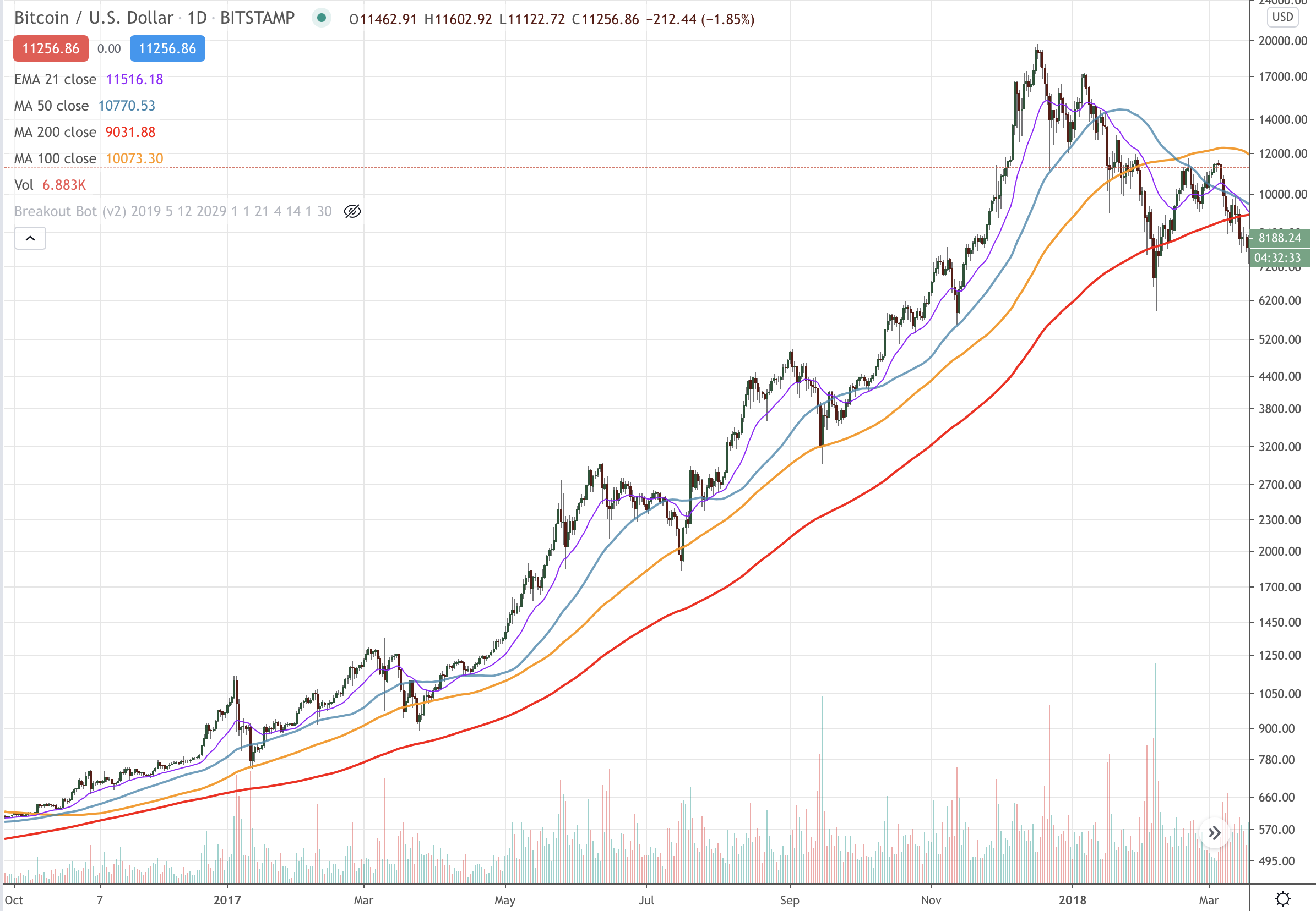
One of the most intuitive trading applications with web stock charts is TradingView. In this application, you can:
You can configure SciChart to do exactly the same operations with our powerful ChartModifier API. We’ve configured a number of modifiers, which add tooltip, legend, zoom and pan behaviour to a chart to recreate the TradingView experience.
Here’s our code to do this:
<s:SciChartSurface>
    ...
    <!-- Declare the ChartModifiers in a SciChartSurface to enable -->
    <!-- TradingView style zooming, panning -->
    <s:SciChartSurface.ChartModifier>
        <s:ModifierGroup s:MouseManager.MouseEventGroup="{Binding MouseEventGroup}">
            <s:ZoomPanModifier IsEnabled="{Binding IsZoomPanEnabled, Mode=TwoWay}" ReceiveHandledEvents="True" />
            <chartPanes:YAxisDragToFreeRangeModifier IsEnabled="{Binding IsYAxisDragEnabled}" ReceiveHandledEvents="True">
                <telerik:EventToCommandBehavior.EventBindings>
                    <telerik:EventBinding Command="{Binding Path=DataContext.DisableAutoRangeCommand, RelativeSource={RelativeSource FindAncestor, AncestorType={x:Type chartPanes:PlotWindow}}}"
                                          EventName="Panned"/>
                </telerik:EventToCommandBehavior.EventBindings>
            </chartPanes:YAxisDragToFreeRangeModifier>
            <s:XAxisDragModifier  IsEnabled="{Binding IsXAxisDragEnabled}" ReceiveHandledEvents="True" />
            <s:MouseWheelZoomModifier IsEnabled="{Binding IsMouseWheelEnabled}" ReceiveHandledEvents="True" ActionType="Zoom" GrowFactor="0.05" XyDirection="XYDirection"/>
            <s:CursorModifier x:Name="CursorModifier" IsEnabled="{Binding IsCursorModifierEnabled}" ShowTooltipOn="Never" ReceiveHandledEvents="True" SnappingMode="CrosshairToSeriesX" />
            <s:RolloverModifier x:Name="RolloverModifier" ReceiveHandledEvents="True" DrawVerticalLine="False" ShowAxisLabels="False" ShowTooltipOn="Never"/>
            <s:ZoomExtentsModifier IsEnabled="{Binding IsZoomExtentsEnabled}" ReceiveHandledEvents="True" />
        </s:ModifierGroup>
    </s:SciChartSurface.ChartModifier>

</s:SciChartSurface>
We use a ZoomPanModifier, XAxisDragModifier, MouseWheelZoomModifier and ZoomExtentsModifier to provide the zoom and pan behaviours. In addition to that, we’ve created a custom modifier which lets us scale the YAxis but ‘undock’ the autoscale like TradingView. There are also additional modifiers called the CursorModifier and RolloverModifier which are being used to provide the crosshairs, and data-source for the legend at the top left of the chart. Which by the way, is a custom legend, declared like this:
<!-- Note, datatemplates have been omitted for brevity -->
<!-- but notice you can bind to RolloverModifier.SeriesData.SeriesInfo -->
<!-- to create custom legends -->
<ItemsControl Grid.Row="0"
              MinHeight="24"
              Margin="20"
              IsHitTestVisible="False"
              Background="#33333333"
              DataContext="{Binding Source={x:Reference Name=PriceChart}, Path=ChartModifier}"
              ItemTemplateSelector="{StaticResource ChartDataTemplateSelector}"
              ItemsSource="{Binding Path=[RolloverModifier].SeriesData.SeriesInfo}"
              Visibility="{Binding Path=[RolloverModifier].IsEnabled,
                                       Converter={StaticResource BooleanToVisibilityConverter}}">
    <ItemsControl.ItemsPanel>
        <ItemsPanelTemplate>
            <StackPanel Orientation="Horizontal" />
        </ItemsPanelTemplate>
    </ItemsControl.ItemsPanel>
</ItemsControl>
The possibilities for SciChart configurability are endless, and we also have similar APIs on Mobile (iOS, Android), MacOS and soon JavaScript.
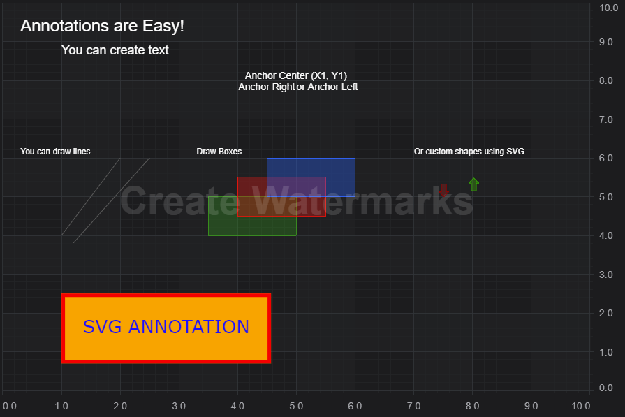
What about viewing your trades on the chart? SciChart also has a feature called Annotations. This allows you to place markers and overlays on the chart, which scroll, pan and zoom with the chart. SciChart’s Annotations API supports out of the box the following:
In the image above you can see Buy / Sell Arrows. These are created by a CustomAnnotation and placed where trades are made on the chart. Additional information can be stored in a tooltip if you wish to inspect the trade and see what is happening in the trading algorithm.
The buy/sell arrows are placed above or below the candle high/low so there is a dot at the exact trade location as well, provided by SciChart’s Scatter series. These are enabled by listening to the trade data feed and simply creating the series / annotations in code and adding them to the chart. SciChart does the rest!
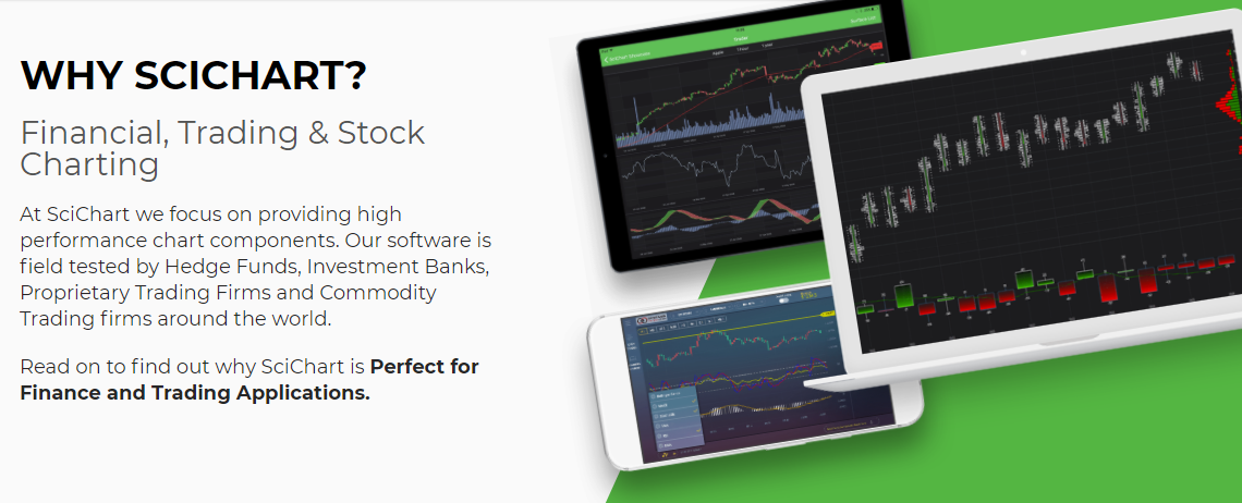
SciChart is a very capable chart component. With support for multi-platform including Windows (WPF, C#), native iOS & Android, Mac OSX and soon JavaScript Charts with our powerful, fast SciChart.js component, there’s a myriad of applications you can create from financial, to scientific, medical and business dashboarding apps.
Our customers (exchanges, brokerages and banks), have used our award-winning chart software to create desktop financial & trading apps, as well as mobile trading apps and we are working to add features for the fintech sector to make SciChart more appealing to this market.
We ourselves are able to offer consultancy with our experts in finance, trading apps as well as high performance data-visualisation. If you wish us to develop an application or consult on the best way to use SciChart then contact sales, we would be very pleased to help!
Recent Blogs
![]()
Queens Award for Innovation
Proud winners of the Queens Award for Innovation, 2019. Awarded on account of our innovative graphics engine which underpins the SciChart library and enables our world-beating charting performance
![]()
National Business Awards
Highly Commended for Lloyds National Business Awards, 2019. Awarded on account of our innovative graphics engine and impressive customer base

Reviews
SciChart has received hundreds of verified, 3rd party reviews
Start a trial and discover why we are the choice
of demanding developers worldwide