Performance Optimisation of JavaScript Applications & Charts
I started programming a long while ago, in 1987 I wrote my first lines of code in Basic on a […]
It seemed all over, bar the shouting.
Lewis Hamilton was 11 seconds ahead of arch-rival Max Verstappen with five laps to go in the Abu Dhabi Grand Prix. It was the last – and Championship-deciding – race of 2021.
Apart from an incident in the first lap, Hamilton drove an exemplary race, and was on target to win a record eighth World Championship title.
But then everything changed.
At the back of the field, almost unnoticed in the excitement building over the imminent waving of the chequered flag, Mick Schumacher and Nicholas Latifi were embroiled in a battle for “who’s not going to finish last.” It was a battle that ended abruptly when Latifi’s car spun out and crashed into a wall.
The incident triggered the introduction of a full safety car and suddenly, an incredible window of opportunity opened for Verstappen. He could pit for fresh tyres and have the chance catch up with Hamilton. Then, even more serendipitously for the Dutch driver, the chief race official made the controversial decision to allow some – but not all – of the lapped cars to overtake the safety car.
This meant that by the time the safety car left the track, Hamilton’s 11 second cushion was gone, and Verstappen was right alongside him for the restart.
There was just one lap to go.
Hamilton started the lap in front but was swiftly overtaken by Verstappen. Hearts pounded as, for a few seconds, it looked as though Hamilton would snatch back the lead. It was not to be.
The rest is, quite literally, history.
It was a dream come true for Verstappen, but the sight of Hamilton sitting motionless in the cockpit of his race car for several minutes after the race ended spoke volumes about what the outcome meant to him.
We can only imagine the heartbreak and surreal sense of disbelief he must have been feeling.
The Championship was his for the taking. Until it wasn’t.
Despite immediate protests from Hamilton’s Mercedes team, Verstappen was crowned the 2021 F1 Champion.
Some might say it was a hollow victory, but whichever side of the fence you’re on, there’s no doubt this is a race people will talk about for months and years to come.
It’s already a divisive topic and will no doubt become even more so if Mercedes goes ahead with additional appeals. Right now, though, it’s looking like a moot point. Verstappen won, Hamilton didn’t. The end.
Except it isn’t.
Not for the teams of engineers whose job it is to analyse every piece of data gathered during the race. Trying to glean exactly what happened, why it happened, how it influenced the outcome, and what lessons can be learned for next time.
What could Hamilton have done to stop Verstappen overtaking him on that last, fateful lap?
What did Verstappen do to give his car the edge it needed to overtake his rival at the critical moment – and keep his advances at bay?
When winning is defined in hundredths of a second, even the most marginal gains can transform performance and ultimately separate winners from losers. But how do the engineers and race strategists isolate what’s needed to achieve these gains?
This is the beauty of the science that is telemetry data visualisation.
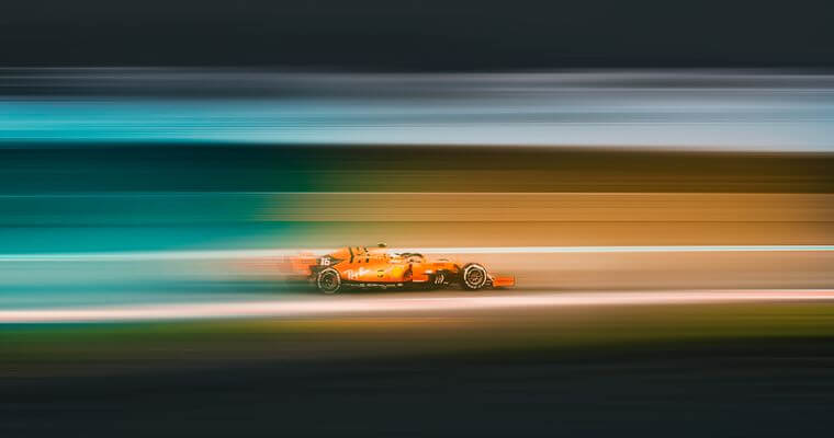
Formula One racing is one of the world’s most popular spectator activities. It is also one of the most data intensive.
The average baseball game lasts three hours and generates three million data points. An F1 race, lasting just over an hour, can generate well over 8 million.
When you watch a Formula One race, have you ever noticed race engineers sitting on the pit wall with banks of screens showing an impressive array of charts and graphs? That’s telemetry data visualisation [An1] in action.
Those complex boxes of numbers, spreadsheets and lines of data are streamed to the engineers, in real time, directly from the cars. They can then use this information to drill deep into what’s happening on and in the car at every second throughout the race. This critical data identifies any anomalies that could cause problems, as well as reveals any opportunities – no matter how small – to improve performance.
There’s no doubt Formula One is one of the most technology-intensive and competitive in the world. In fact, it’s not a complete exaggeration to say that today’s modern F1 cars are less actual car and more computer. Every car is equipped with up to 1000 [An2] sensors that generate millions of telemetry data points which are then transmitted to the engineers in the pits.
An F1 car’s success is due as much to the engineers being able to successfully extrapolate insights from this complex data as it is to the skill and experience of the driver.
For this reason, modern F1 teams are extremely reliant on their partnerships with technology providers. The ability to leverage high-performance computing, machine learning, edge computing and big data visualisation [An3] is key to gaining those crucial milliseconds on the track.
Data is a competitive advantage, and it’s absolutely critical that it is transmitted and analysed at speed. Time is literally money.
At SciChart, our expertise in, and passion for, real-time telemetry data visualisation has made us the go-to choice for Formula One, motorsport and automotive applications.
Over our many years in the industry, we’ve helped our F1 partners set world records and claw back vital seconds in the corners and the pits.
As a data visualisation SDK, our 2D and 3D charts, libraries and data visualisation solutions are embedded in software packages that are used to obtain extensive data from control systems and transmit it from the car to the race team or automotive analysts.
This technology helps our partners extract priceless insight from data, and inform decisions regarding:
and so much more.
Our analytics toolsets lie at the heart of decision making and design processes, not only giving you a deep understanding of design and performance, but also the ability to capitalise on it.
Tyre temperatures, acceleration profile, RPM, steering, fuel economy, driver response to G-forces…every action is tracked, and every consequence measured.
Think about this:
Over 2GB of data is sent to the team telemetry every single lap.
The data accumulated over an entire race can be as much as 3TB. [An4]
With SciChart, you can convert this overwhelming amount of high-rate data into meaningful charts, visualisations, and actionable insights. Unlike any other charting SDK on the market, SciChart is powered by an in-house proprietary 3D rendering engine which leverages gaming technology to bring extreme performance to the data analytics field.
This means up to 100 billion data points can be visualised on charts, giving you unparalleled insight, flexibility, and the ability to work across multiple platforms.
All of which gives you unprecedented visibility into your data.
Because you can’t measure what you can’t see. You can’t analyse what you can’t measure.
And you can’t optimise what you can’t analyse.
If you’d like more information on SciChart’s award-winning software, please get in touch. We’d love to see how what we do can make what you do, better.
Recent Blogs
![]()
Queens Award for Innovation
Proud winners of the Queens Award for Innovation, 2019. Awarded on account of our innovative graphics engine which underpins the SciChart library and enables our world-beating charting performance
![]()
National Business Awards
Highly Commended for Lloyds National Business Awards, 2019. Awarded on account of our innovative graphics engine and impressive customer base

Reviews
SciChart has received hundreds of verified, 3rd party reviews
Start a trial and discover why we are the choice
of demanding developers worldwide