Performance Optimisation of JavaScript Applications & Charts
I started programming a long while ago, in 1987 I wrote my first lines of code in Basic on a […]
I am a member of Revolve NTNU, a Norwegian Formula Student team. Every year, a group of ~70 engineering students from over 20 different fields of study, design, build and test a new racecar. The technology in these racecars is pushed to limits, and the students get to experience the full engineering cycle. After 8 months of design work and 3 months of testing, it’s time for competition. At the biggest racetracks in Europe, teams from Universities all over the world gather to find out who has developed the best racecars, and who deserve to be called the best engineers.
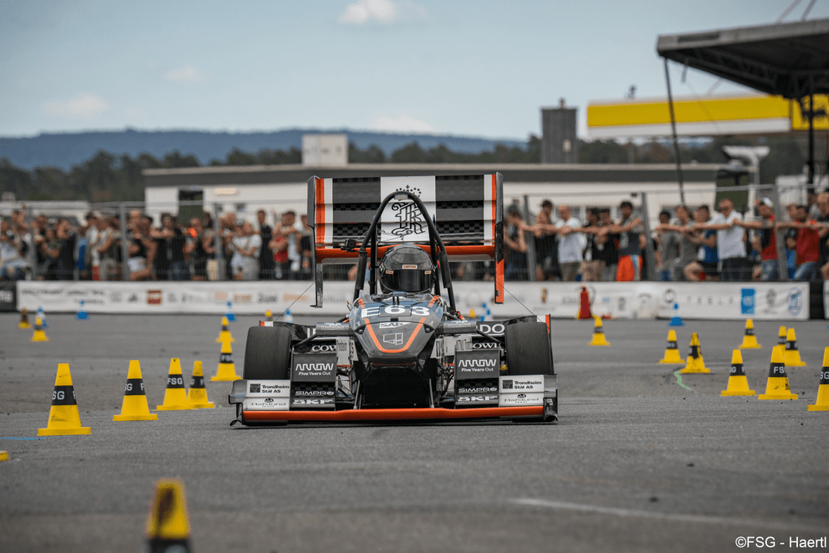
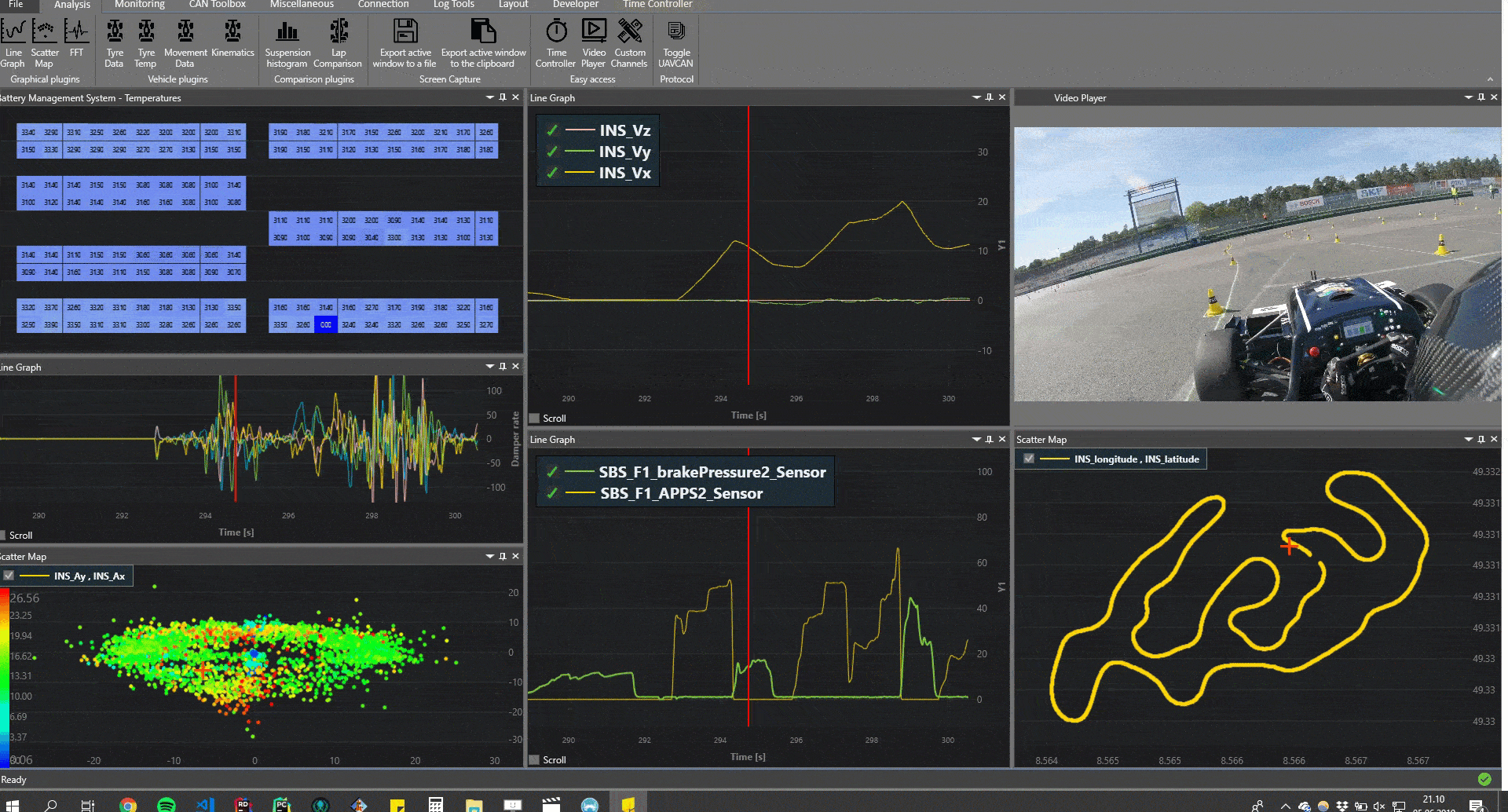
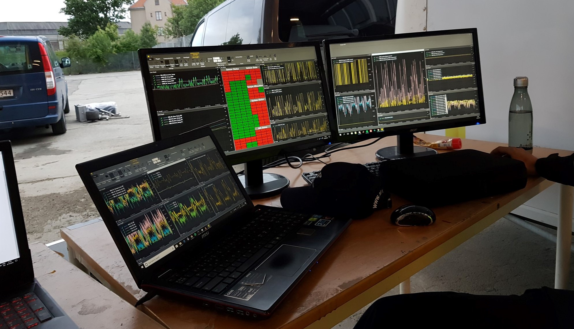
Yes, we build racecars. Every year, our cars get faster, lighter and smarter. Our latest creation, called Nova, weighs in at 162.5 kg, and is equipped with a self-designed 4WD electric powertrain and a full aerodynamic package. To ensure that Nova is operating as expected, it is fitted with over 300 sensors. Using WPF and SciChart, we have been developing Revolve Analyze, a .NET application to monitor data in real time, and analyse it afterwards. During races, Nova streams sensor measurements, control system outputs and information about all electronic systems to the base station. Here everything is monitored by team members, using
Revolve Analyze.
We have been analysing data using Revolve Analyze since 2017. This has given us a lot of insight into the behaviour of individual systems. Data analysis is important to push our technology further, and will also translate into lower lap times on the track.
Data analysis is important to push our technology further, and will also translate into lower lap times on the track.
An area we have not explored as deeply yet, is Race Strategy. Understanding the bigger picture of energy management, driver styles, lap times and temperature development still holds a lot of potential performance. This is where we started exploring the different chart types in SciChart to create a lap-by-lap comparison tool to analyse these areas.
With a little background, and a “problem statement”, it’s time to start looking at the solution. For this problem, I have divided the solution into 3 parts:
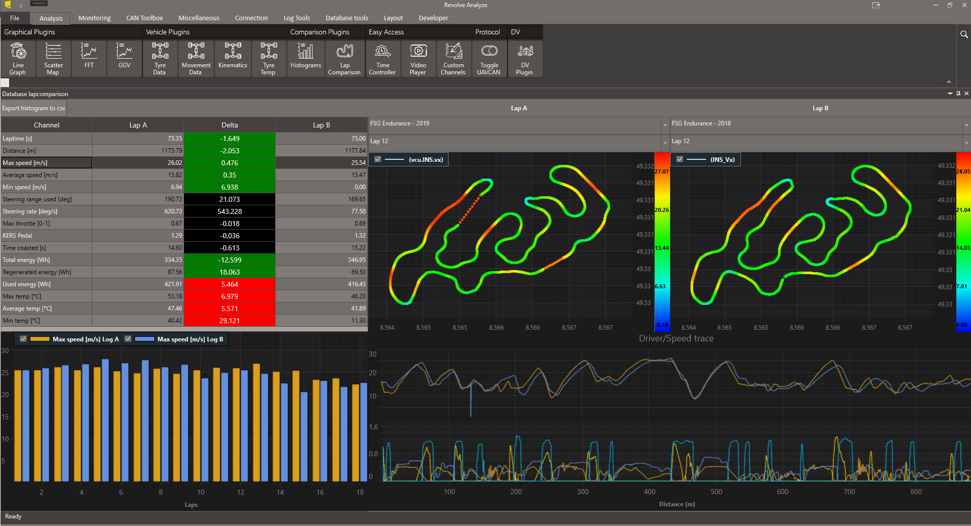
After a race, the software does not know where the first lap starts and the last lap ends. To determine this, a little help from the user is required. Due to the nature of the competition, laps can be defined in different ways. Some events run for 20 laps on a continuous circuit, others consist of two runs on a track with a separate start and finish. Therefore we present the user with a map of the track, and allow them to select the start and finish.
Using the SciChart ExtremeScatterseries, we draw a map of the track. Data is from the onboard INS, which has two GPS antennas. The user can either use some presets, or tweak the lap detection algorithm parameters to their likings. To help the user, the track has been colored after the car’s speed at each position.
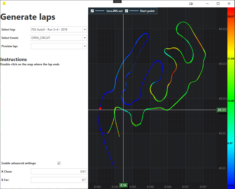
After the user double-clicks the start/finish location, the laps are generated. This is done by a relatively simple, but effective algorithm. The two parameters are used to detect crossing the start/finish and detecting the car being around halfway the lap.
The algorithm starts by finding the first time the car’s GPS signal is close to the start point. From here, every point in the log is checked. A new lap cannot be registered until the algorithm has found a point where the car is halfway around. For every time a new lap start is detected, the timestamp is registered as the end of the previous lap and the start for next.
These timestamps are then stored for use by the plugin. When the user selects a different lap to compare, the lap data is used to find the relevant data in the database, and calculates all information for the analysis.
Now that the user has split the races into laps, we need to visualise key metrics that affect the Race Strategy. For this dashboard we designed four UI elements, of which three utilize SciChart charts:
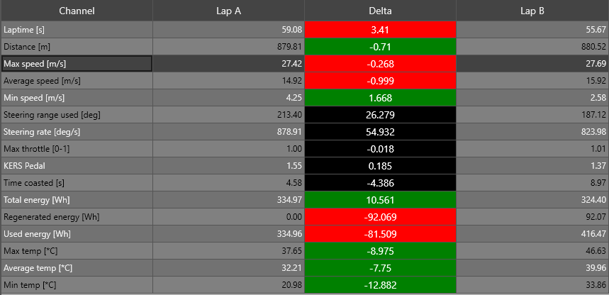
This element serves two purposes. First of all, it displays some of the important readings from the car for each of the two laps we are comparing. In addition, the user can select rows in the table to change the visualisations in the charts. The values in the table are calculated for all laps in a log on launch, meaning they can easily be updated when the user chooses different laps.
The elements are built up of standard WPF textblocks, in a datagrid.
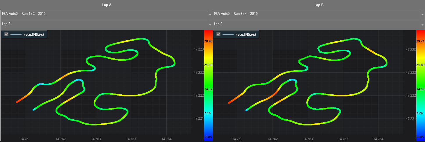
Using the PaletteProviders available in SciChart, we have developed a tool to visualise how the car behaves over the course of a lap. To create the track maps we use three data channels.
Longitudinal and lateral GPS coordinates are used to plot the track. An additional third channel is used for coloring the track. Using the built in customisation tools, we can define a gradient using the maximum and minimum values for the gradient channel. This is then given to the ScatterMapPointMarkerPaletteProvider, which renders the chart instantly. Whenever the user selects a new row in the table, the trackmaps are updated with new scalings.
This element was actually not developed for this plugin. It has been reused from the ScatterMap plugin. Originally, it was developed for a user interface where any 2 channels from the car could be plotted against each other. A class holding a set of scatter map settings is passed to the element, which then does all calculations and renderings. This meant that implementing this map feature went very quickly. Creating reusable SciChart elements has been very useful in feature development, and this element is also used in the lap generation window.
Creating reusable SciChart elements has been very useful in feature development.
I will show some code snippets that can help you create your own scatter charts with a color gradient. This can be useful for a lot of visualisations, and is a tool we use multiple places in our telemetry software. To create such a chart, we need data from three channels: X-axis channel, Y-axis channel and a gradient channel. We will use the Y-values from each of the three channels.
Data from our race cars come in at irregular time intervals, meaning that not all data channels have the exact same timestamps. Therefore, the first step is to sample all involved channels, so that we have Y-values for the same timestamps for each channel. This is done by interpolation, using a sampling rate of 100 samples/second.
private List<double> SampleGraph(XyDataSeries<long, double> series, int samples)
{
    long start = (long) series.XMin;
    long end = (long) series.XMax;
    long diff = end - start;
    var data = new List<double>();
    for (var n = 0; n < samples; n++)
    {
data.Add(series.YValues[series.FindIndex(start + diff * ((double) n / (double) samples), SearchMode.Nearest)]);
    }

    return data;
}
After the SampleGraph method has been executed for each of the three channels, we can start computing the colors. For the gradients, we have implemented a few options for the user. The user can choose to use a rainbow gradient, a single color gradient (light to dark), and the user can specify whether to use a local minimum and maximum or a global minimum and maximum for the scaling. Based on these choices, a color is calculated for each datapoint:
private List<Color> GenerateColorListForChannel(List<double> gradientData, GradientType gradientType, bool useGlobalScale)
{
    List<Color> colors = new List<Color>();
    var min = useGlobalScale ? _globalGradientMin : (gradientData.Any() ? gradientData.Min(val => val) : 0);
    var max = useGlobalScale ? _globalGradientMax : (gradientData.Any() ? gradientData.Max(val => val) : 0);
    foreach (double value in gradientData)
    {
        var percentage = (value - min) / (max - min);
        if (gradientType == GradientType.Rainbow)
            colors.Add(ColorTools.Rainbow(percentage, 0, 255));
        else
            colors.Add(ColorTools.ColorGradient(percentage, gradientType));
    }
    return colors;
}
I have also included a snippet for calculating the rainbow gradient for each point. This min and max parameter can be used to create lighter or darker rainbows. We use the range 0 to 255, for a bright rainbow:
/// <summary>
/// Generate a rainbow colored gradient
/// </summary>
/// <param name="percentage">Where along the scale to pick the color</param>
/// <param name="min">Used to scale the darknes of the rainbow</param>
/// <param name="max">Used to scale the darknes of the rainbow</param>
/// <returns></returns>
public static Color Rainbow(double percentage, byte min, byte max)
{
    max -= min;
    Color c = new Color();
    if (percentage <= 1 / 4f)
    {
        if (percentage < 0)
            percentage = 0;
        //From Blue to Cyan
        //G 0 -> G 255
        byte g = (byte) ((percentage * 4) * max);
        c = Color.FromRgb(min, (byte) (g + min), (byte) (max + min));
    }
    else if (percentage >= 1 / 4f && percentage < 2 / 4f)
    {
        //From Cyan to Green
        //B 255 -> B 0
        byte b = (byte) (max - ((percentage - 1 / 4f) * 4) * max);
        c = Color.FromRgb(min, (byte) (max + min), (byte) (b + min));
    }
    else if (percentage >= 2 / 4f && percentage < 3 / 4f)
    {
        //From Green to Yellow
        //R 0 -> R 255
        byte r = (byte) (((percentage - 2 / 4f) * 4) * max);
        c = Color.FromRgb((byte) (r + min), (byte) (max + min), min);
    }
    else if (percentage >= 3 / 4f)
    {
        //From Yellow to Red
        //G 255 -> G 0
        if (percentage > 1f)
        {
            percentage = 1f;
        }

        byte g = (byte) (max - ((percentage - 3 / 4f) * 4) * max);
        c = Color.FromRgb((byte) (max + min), (byte) (g + min), min);
    }

    return c;
}
The last step before we can render our chart, is to perform any interpolation the user might want. For some data channels, the sending frequency is low, meaning the charts aren’t very smooth. For example in maps with few points we might want to smoothen it out. To achieve this, the X, Y and color values are interpolated with additional points.
private IRenderableSeriesViewModel InterpolateDataseries(ColorType colorType, int interpolation, double[] xValues, double[] yValues, List<Color> colors, IRenderableSeriesViewModel serie)
{
    var totalNumberOfElement = (xValues.Length - 1) * (interpolation + 1);
    double[] allXValues = new double[totalNumberOfElement];
    double[] allYValues = new double[totalNumberOfElement];
    Values<Color> allColorValues = new Values<Color>(totalNumberOfElement);

    double start, end;

    for (int n = 0; n < xValues.Length - 1; n++)
    {
        for (int i = 0; i < interpolation + 1; i++)
        {
            start = (interpolation + 1.0 - i) / (interpolation + 1.0);
            end = i / (interpolation + 1.0);

            // Interpolate X and Y values
            allXValues[n * (interpolation + 1) + i] = xValues[n] * start + xValues[n + 1] * end;
            allYValues[n * (interpolation + 1) + i] = yValues[n] * start + yValues[n + 1] * end;

            if (colorType != ColorType.Solid)
            {
                // Interpolate gradient colors
                byte r = (byte) (colors[n].R * start + colors[n + 1].R * end);
                byte g = (byte) (colors[n].G * start + colors[n + 1].G * end);
                byte b = (byte) (colors[n].B * start + colors[n + 1].B * end);
                allColorValues[n * (interpolation + 1) + i] = Color.FromRgb(r, g, b);
            }
        }
    }

    // Add data to series
    ((XyDataSeries<double, double>) serie.DataSeries).Append(allXValues, allYValues);

    // Add the gradient to the series using a PalletteProvider
    if (colorType != ColorType.Solid)
    {
        ScatterMapPointMarkerPaletteProvider palette = new ScatterMapPointMarkerPaletteProvider() {
            data = allColorValues
        };
        serie.PaletteProvider = palette;
    }

    return serie;
}
At the end of the interpolation, the data is added to the series, and the colors are used to create a ScatterMapPointMarkerPaletteProvider. This is a SciChart class, used to provide the chart with the gradient. Simply setting the series PalletteProvider to our instance of the ScatterMapPointMarkerPaletteProvider will render our gradient when the series is added to the surface.
// Add the gradient to the series using a PalletteProvider
if (colorType != ColorType.Solid)
{
    ScatterMapPointMarkerPaletteProvider palette = new ScatterMapPointMarkerPaletteProvider() {
        data = allColorValues
    };
    serie.PaletteProvider = palette;
}Visualising a metric over the course of a lap can give some good insights into the car through specific corners and straights, but for a Race Strategy to be understood we also need to see it develop over the course of the entire race. To visualise this, we implemented a histogram chart.
For each row the user selects, the histogram will update to show that metric for every lap of the two races. This can give useful information about energy regeneration and usage or the development of lap times.
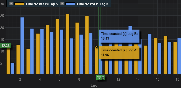
Drivers can use these histograms to compare their driving styles. One discovery we made was the big difference in coasting time for our 2 drivers. Coasting occurs when a driver isn’t pushing any of the pedals, so no acceleration input. Here it was discovered that even though driver A coasted a lot more than driver B, their lap times were comparable. This then led to some discussions and experimentation on pedal inputs during the next testing days to find the best way to operate the car.
Visualising the driving styles in histograms gave us ideas to experiment with pedal inputs to find the best way to operate the car.
The last tool that was added to the dashboard was a visualisation of the car’s speed and the driver’s input over the course of the lap. Since not all lap times are identical, time is not always the best unit for X-axis. Instead, we converted the x values to distance into the lap. Using the speed measurement, and their timestamps, we integrated the velocity to get an approximation of distance travelled. This was then used as the XValues in the XyDataseries that make up the line charts. Visualising the speed over two laps, can give a clear indication of where on the track time is gained and lost. This can be seen in the top chart. In this example, the yellow data is from the first AutoX attempt, and the blue is the last AutoX attempt. It’s clear that the last attempt kept a higher speed throughout most of the lap.
Visualising the speed over two laps, can give a clear indication of where on the track time is gained and lost.
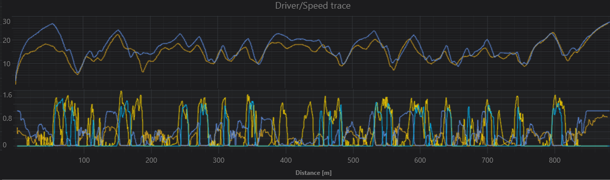
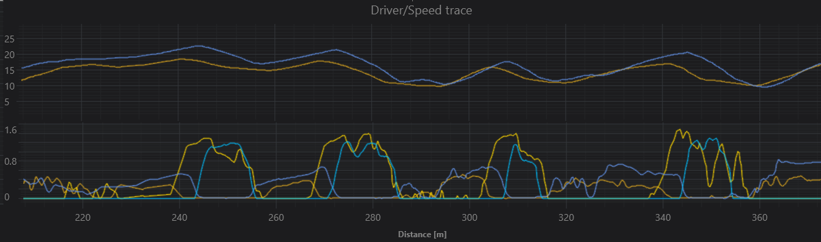
The bottom chart shows the drivers pedal inputs. The bright lines are the brake pedal inputs, the dimmer ones are the acceleration pedal. One thing you will quickly notice is that the driver doesn’t put the throttle all the way down. One reason for this is to conserve energy, as efficiency is 10% of the overall competition score. This becomes even clearer when zooming in on the traces. The bright lines follow the brake pedal, and the dimmer lines represent the throttle.
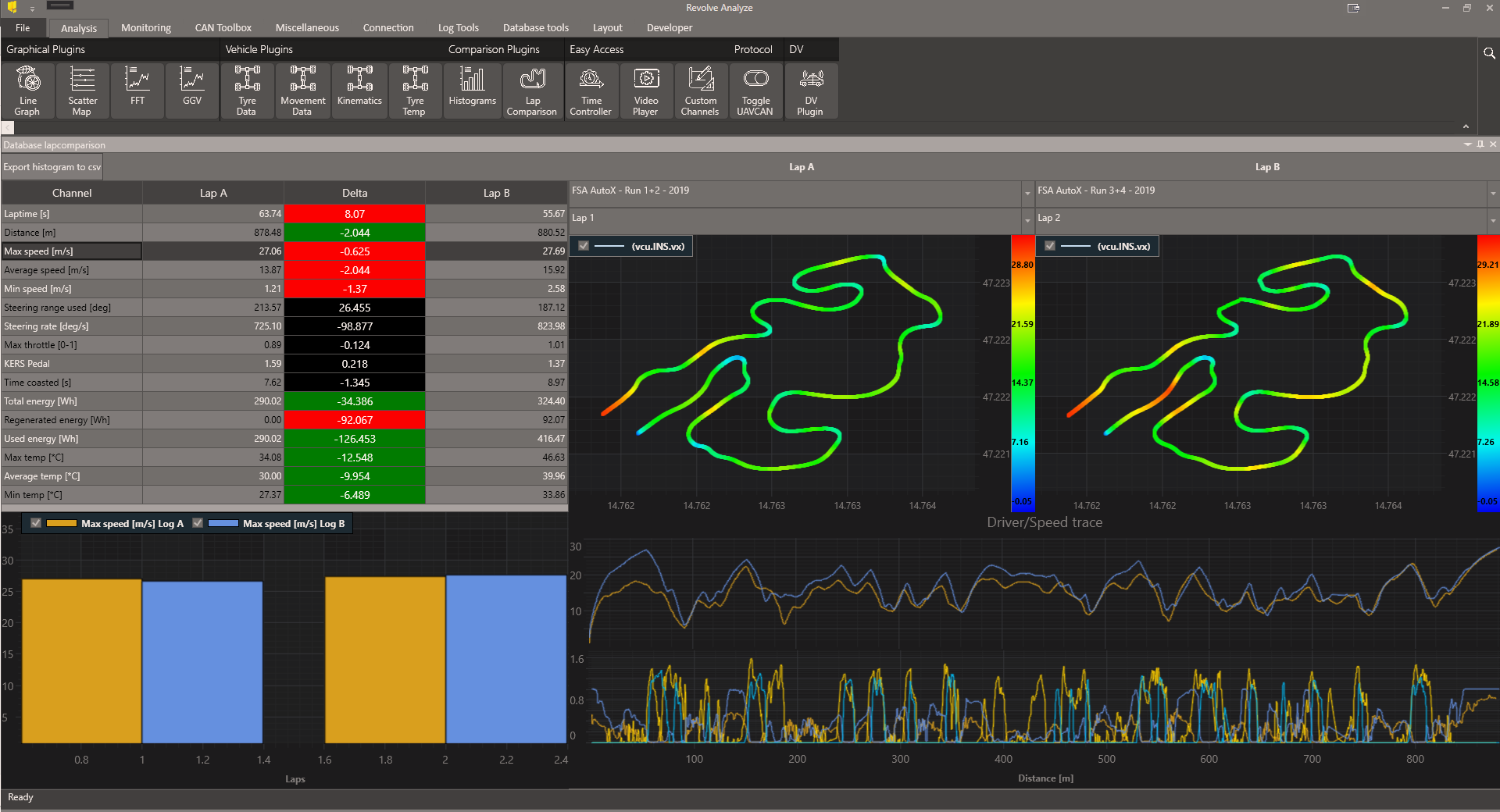
The Lap Comparison dashboard has given us a quick and efficient way to understand how strategic choices affect overall performance. All charts work together to paint the bigger picture of motor racing. Drivers have learned from each other’s styles, electrical engineers have learned more about the relationship between energy usage and lap times, and the vehicle dynamics engineers have discovered how to adjust control systems to allow each driver to use their own style. This is possible both for Endurance races with 20 laps and for the shorter AutoX races with 2 laps.
Learn more about the Revolve NTNU team from the videos:
SciChart (www.scichart.com) provides high performance real-time chart components on the WPF (Windows), iOS, macOS, Android and Xamarin platforms and soon JavaScript for web. SciChart is already used across the globe in a wide range of domains. We now cater to a loaf of global MedTech companies, top US Banks, Top Global Petrochemical companies, and thousands more. It is also used by several top Formula One (F1) Teams worldwide.
Recent Blogs
![]()
Queens Award for Innovation
Proud winners of the Queens Award for Innovation, 2019. Awarded on account of our innovative graphics engine which underpins the SciChart library and enables our world-beating charting performance
![]()
National Business Awards
Highly Commended for Lloyds National Business Awards, 2019. Awarded on account of our innovative graphics engine and impressive customer base

Reviews
SciChart has received hundreds of verified, 3rd party reviews